Credit Card Landing Page Redesign
Redesigning the most visited landing page for OCA (Itaú Uruguay) to increase application conversion, clarify network differences (Visa vs. Mastercard), and streamline the user acquisition funnel.

About the Project
OCA is one of Uruguay’s leading financial institutions under Itaú Latam. In the original version, the landing page was excessively long, and its primary core products, the credit cards (Visa and Mastercard), were buried near the bottom of the page, leading to friction and high user drop-off.
As the Product Designer in the Latam team, I led the redesign of this flagship page, conducting continuous design critiques with cross-functional stakeholders to elevate the core products to the top of the funnel.
Research & Discovery
To guide the redesign, we conducted competitive benchmarking across major fintechs in Brazil, Uruguay, and Argentina, alongside a quantitative user study. Key insights from this research were directly incorporated into the new architecture, ensuring we addressed real user barriers and clarified product differences upfront.


Product Hierarchy
We brought the credit card selector to the top of the page, giving immediate visibility to the core offering ("Elegí la tuya") and allowing users to compare Visa and Mastercard benefits right away.
The page structure was streamlined into a modular visual system, eliminating unnecessary length while establishing a bold, high-contrast visual identity anchored in OCA’s brand blue.
UX & Alignment
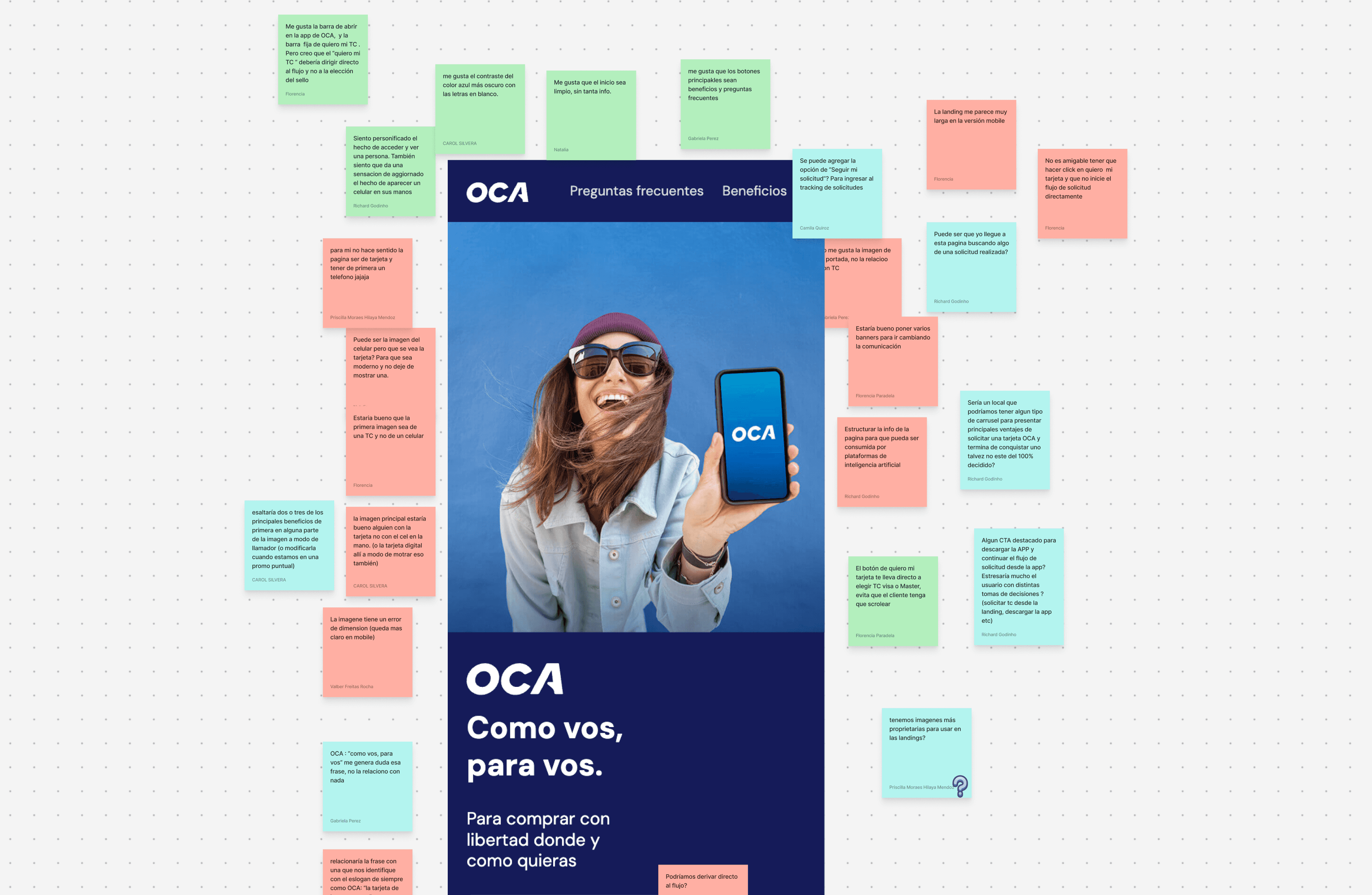
Through iterative design critique sessions, we reordered the remaining modules into scannable sections—placing day-to-day benefits, localized discounts, and loyalty rewards where they support the decision journey without cluttering the screen.
Key Takeaway
By shortening the user journey, moving core products above the fold, and leveraging research insights, this redesign transformed OCA’s most-visited page into a high-converting acquisition channel.